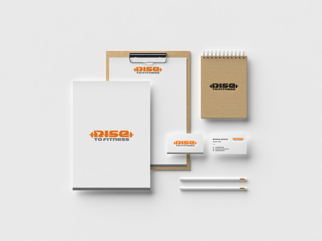
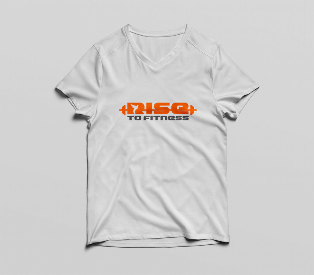
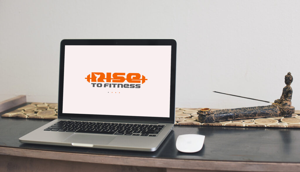
Rise to Fitness: Branding
We had the privilege of collaborating with our client to bring Rise to Fitness, a dynamic fitness club, to life. Our goal was to create a captivating logo that embodies the spirit of early morning workouts and captures the essence of strength and determination.
In crafting the logo, we carefully considered the client’s vision and the core values of Rise to Fitness. The focal point of the design is a rising bird cleverly integrated into the negative space of the letter “R”. This symbolizes the energy and motivation that accompanies the start of a new day—a reminder to seize the morning and embrace the challenges that lie ahead.
To further accentuate the gym theme, we incorporated long dumbbells, an iconic symbol of strength and physical fitness, into the design. This element not only adds visual interest but also reinforces the commitment of Rise to Fitness to provide a space for individuals to push their limits and achieve their fitness goals.
The color scheme of the logo plays a crucial role in conveying the club’s energetic and vibrant atmosphere. Vibrant shades of orange were selected as the primary color, symbolizing energy, enthusiasm, and motivation. This energetic palette is perfectly aligned with the spirit of Rise to Fitness, encouraging members to unleash their inner potential and rise to new heights.